Adaptive Development: How to Bring Your Apps to Googlebook
 Public
- 25 Sep, 2026
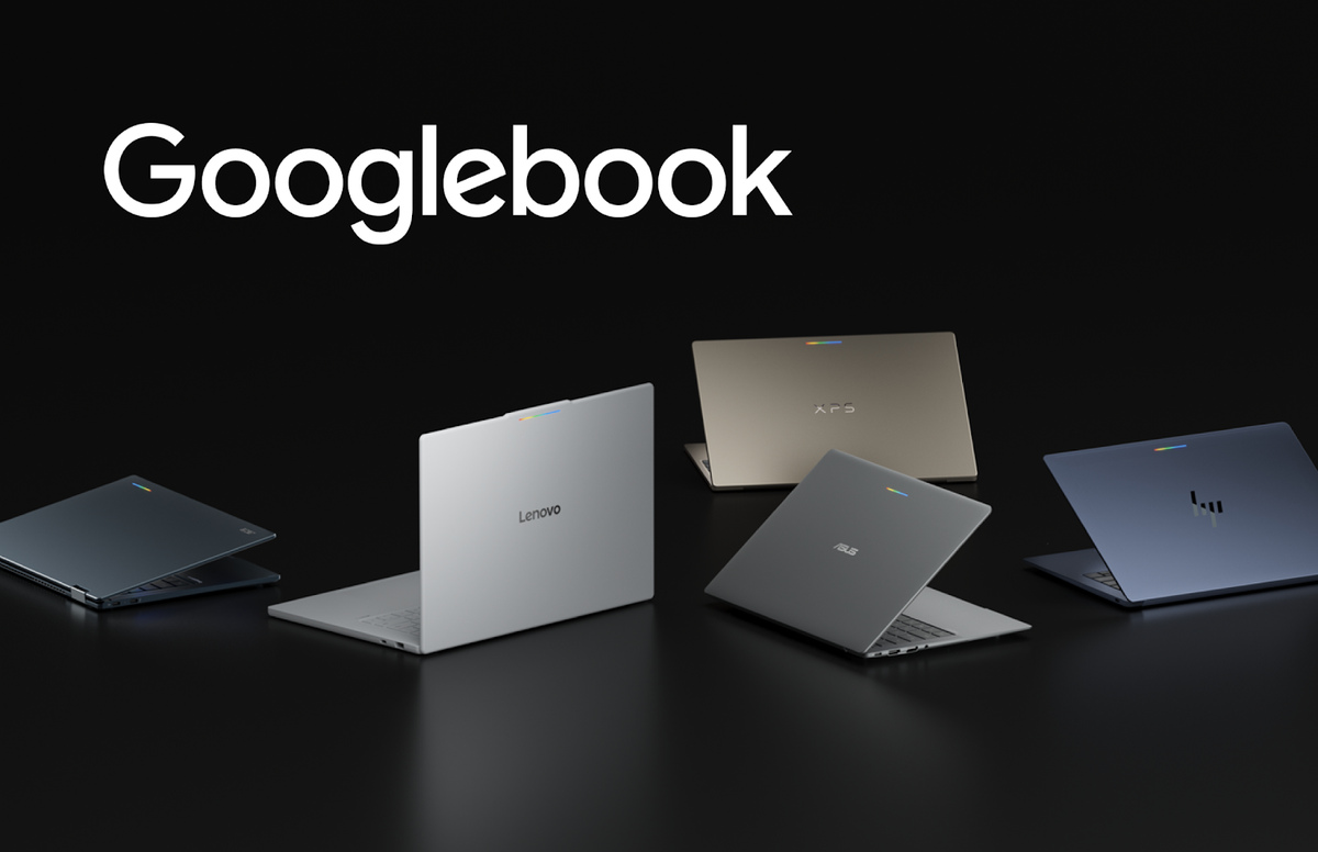
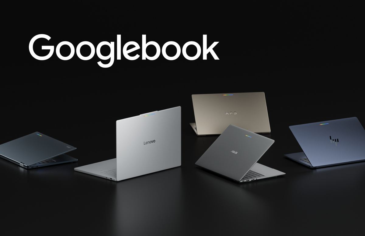
Googlebook introduces a new category of laptops sharing a common Android foundation, with hardware from partners such as HP, Dell, Lenovo, Acer, and Asus. The devices pair mobile convenience with desktop power: high-resolution OLED touchscreens, dedicated keyboards, precision trackpads, all-day battery life, and OS-level Gemini Intelligence. Users can move fluidly from quick phone interactions into richer, more immersive laptop sessions. Apps that arrive optimized earn dedicated badging, enhanced search placement, and featured spots on curated Google Play homepages, along with a path into the Apps Experience Program and its new rate card. Optimized apps are also highlighted during phone-to-Googlebook setup, giving them day-one presence.
The core message is that you do not need a standalone app. Adaptive development lets modern Android apps scale across large displays, new postures, and emerging form factors. An existing foundation of adaptive UI, window size classes, and multi-input support is enough to deliver an optimized experience. On a laptop your app runs in a desktop environment where expectations shift toward higher information density, precision input, and active multitasking, so an adaptive layout should reorganize content into functional groupings rather than simply stretching a mobile interface across a wide screen.
The practical patterns start with a multi-pane architecture that expands, reflows, or reveals richer detail as window boundaries change. Navigation 3 provides adaptive scene strategies coordinated directly from the back stack; ListDetailSceneStrategy and SupportingPaneSceneStrategy enable side-by-side layouts when space allows, while scene decorators wrap screens with persistent desktop navigation rails. Layout primitives like Grid and FlexBox, and soon the experimental MediaQuery and Styles APIs, help organize complex content and adjust visual styles dynamically. Because free-form windows resize at any time, layouts should respond to window size classes rather than physical display dimensions.
Desktop design also accounts for ergonomic viewing distances and precise pointer targets: adjust the type scale for larger displays, set layout max widths for readable line lengths, and define explicit click targets to prevent misclicks. When the core layout is adaptive, you can add differentiated desktop features. Jetpack Compose natively supports physical keyboard navigation and pointer selection, so you can integrate contextual cursors for text entry, pane resizing, and tool selection, plus right-click context menus, hover states, and a Keyboard Shortcuts Helper for discoverable shortcuts. Multi-instance support unlocks side-by-side workflows with independent windows, and drag and drop lets users move text, images, and files between windows or onto an empty workspace to start a new task.
Beyond individual windows, Continue On keeps experiences connected across phones, tablets, and Googlebooks through bidirectional handoff; HandoffActivityData preserves context like document position or active tabs, with optional web fallbacks. Complement this with customizable widgets and benchmark against desktop app quality guidelines. Testing fits the existing workflow via the Android Studio desktop emulator, which runs a virtual desktop environment to test free-form resizing, multi-instance interactions, and mouse, trackpad, and keyboard input. The adaptive skill gives AI agents the context to refactor mobile layouts into responsive Compose containers automatically, and installs directly through the Android CLI.